Researcher & Designer
Feb '25 - May '25
Overview
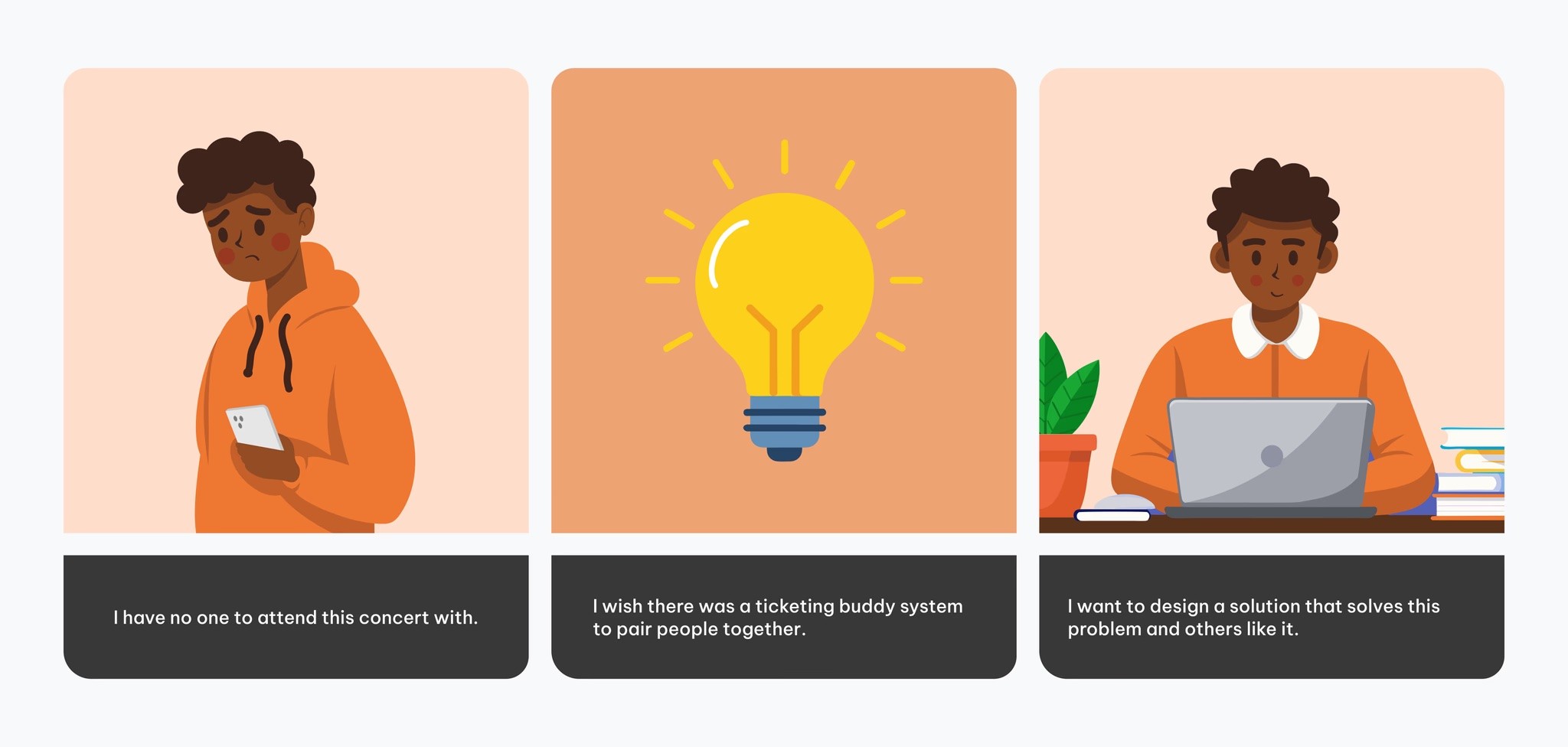
From my own personal experiences with not having friends to go to concerts with, an Idea for a social networking platform designed for making new friends and building platonic relationships was born.
By applying the design process, I conceptualized a social networking solution for platonic connection.
I wanted to attend a concert but couldn’t find any friends who were available to join me. I remember wishing there were an app, or even a feature on Ticketmaster, that could match people who were also going solo, like a built-in buddy system. That moment sparked the concept, which I later developed into an app designed to help people meet new friends, whether for casual hangouts or building lasting friendships.
Understanding the user's context
I conducted a survey to better understand the challenges people face when making new friends outside of familiar environments like work or school, and to move beyond my own assumptions about what activities people prefer not to do alone. I also wanted to explore the contexts in which strangers would feel comfortable meeting for shared activities.
The qualitative data revealed behaviors and patterns in how people attempt to form new friendships.
I organized responses from 20 participants into an empathy map to evaluate their collective journeys more clearly.
Analyzing the Solution Landscape
To maximize innovation, I analyzed what currently works in the social networking industry, identified opportunities for improvement, and explored ways to push beyond existing solutions.
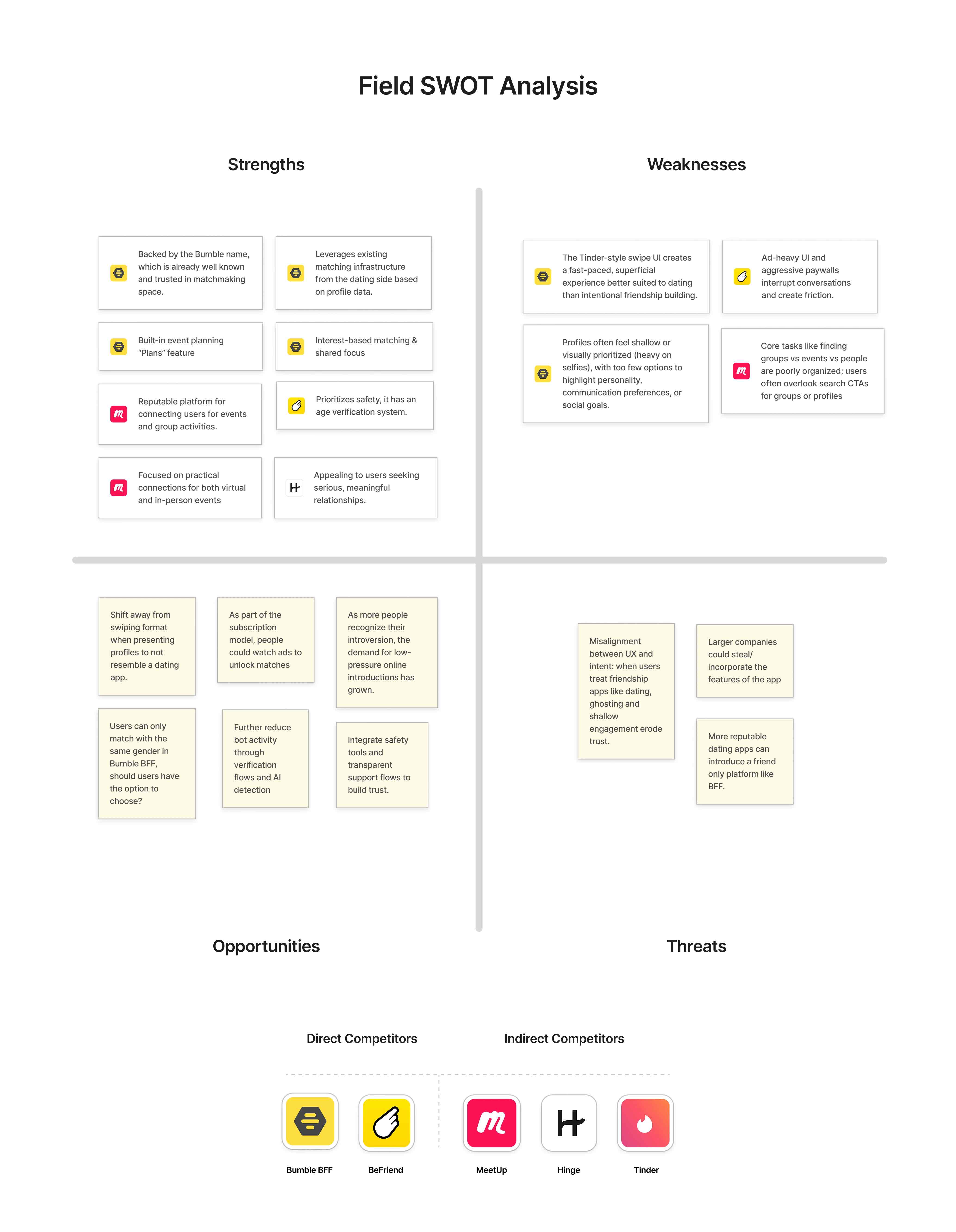
User's Needs & Motivations
Based on discovery research data, my synthesis indicates that the concept should focus on delivering the following solutions:
Fostering Meaningful Connections
Highlighting similar interests when pairing potential matches.
Authentication & Security Measures
Verification systems to help reduce bot activity
Goal Oriented Connection
Making it easy for users to find someone to join them for a particular task.
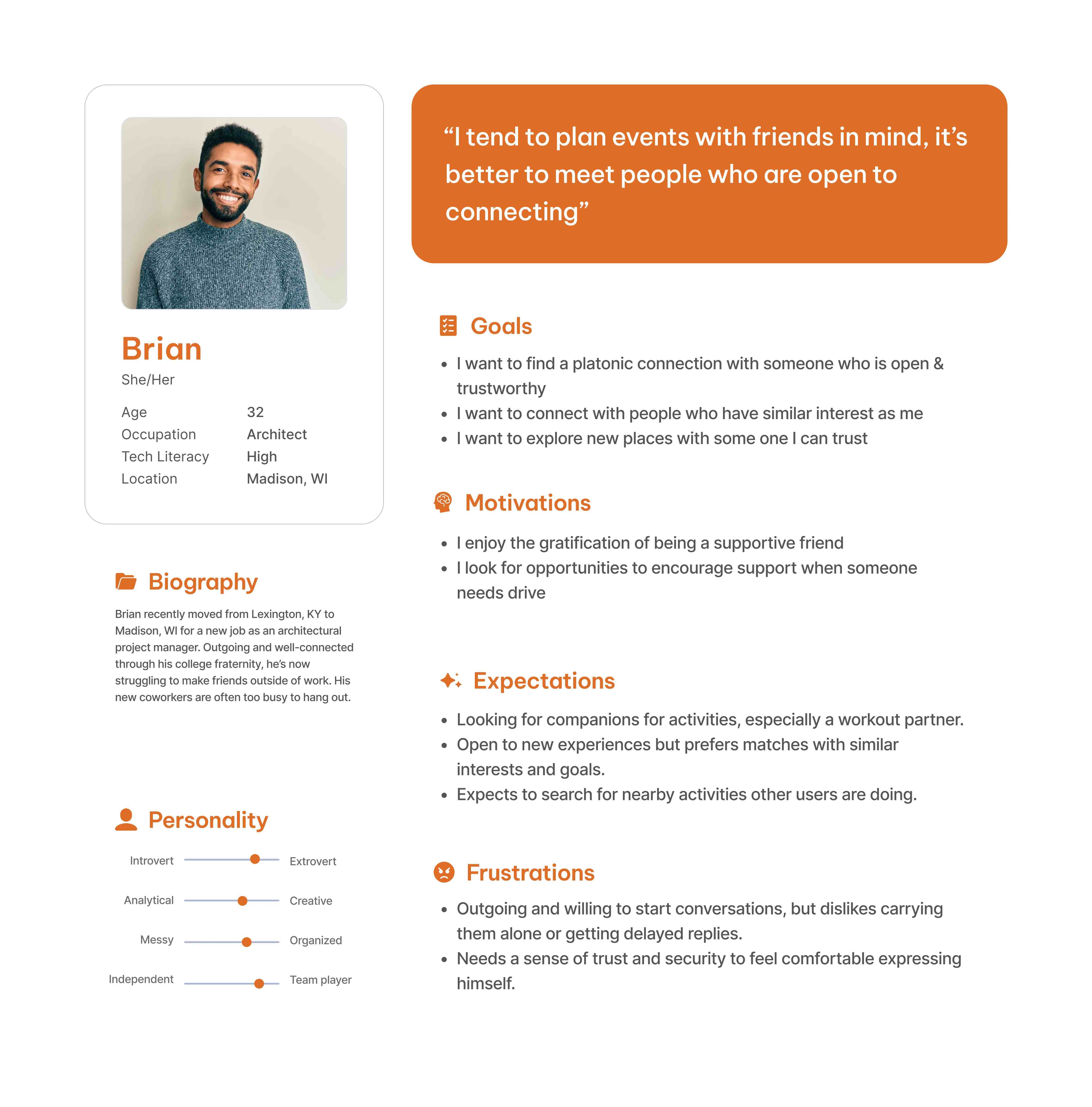
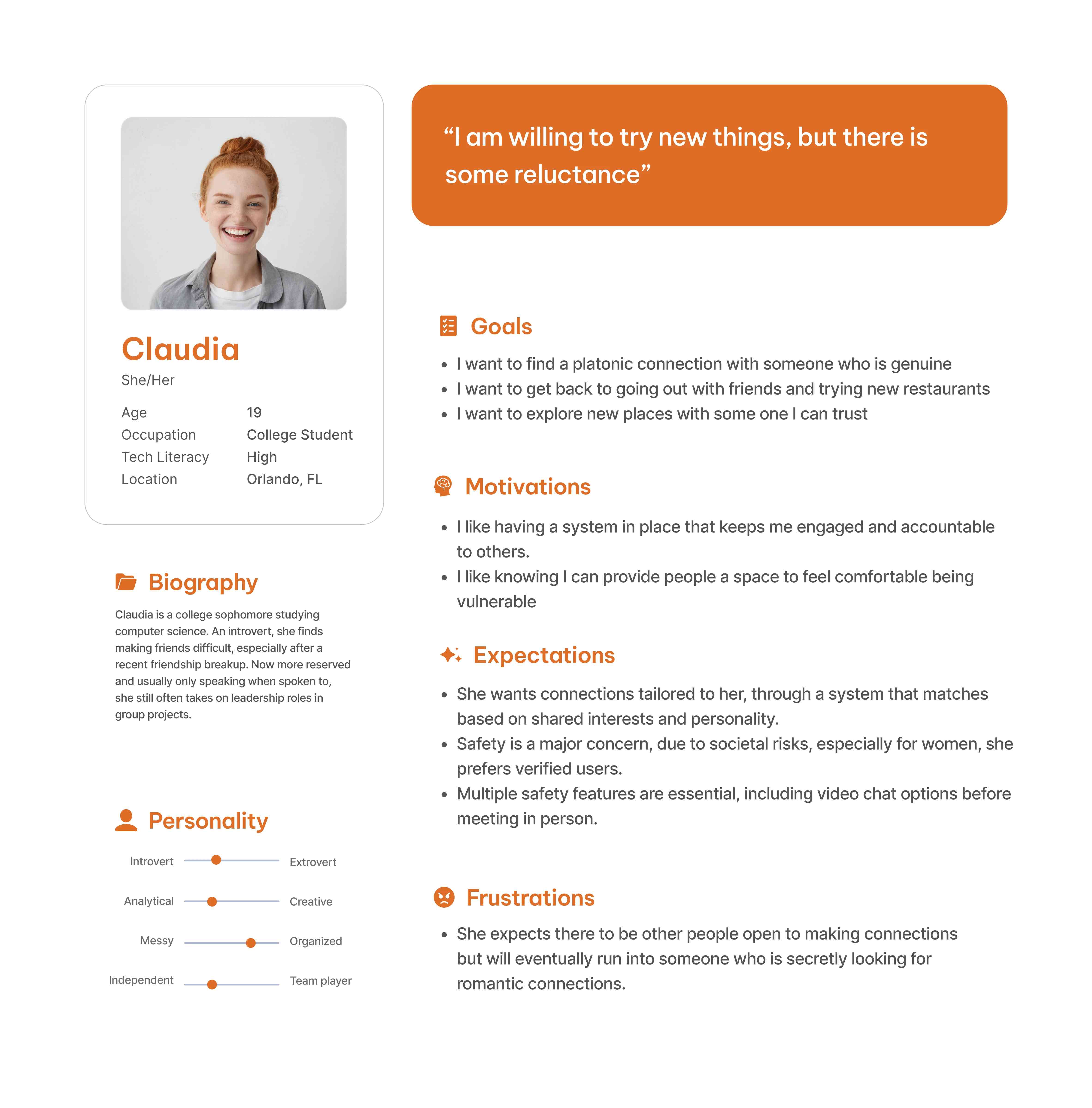
Using personas to inform Ideation
I created two representations of who would be the typical users for my concept app.
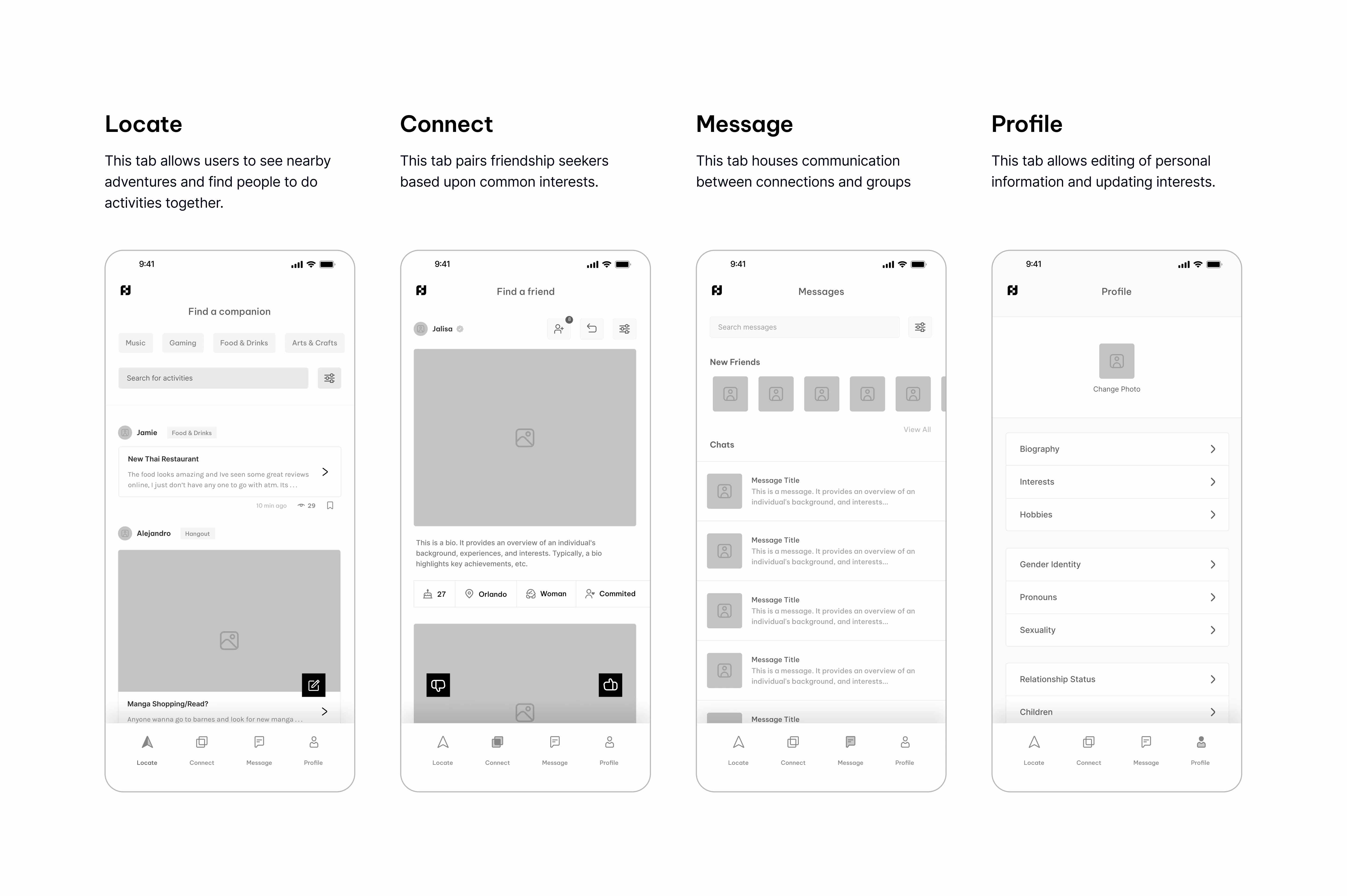
Wireframing Ideas & Structure
I designed a wireframe based on user needs for friend finding social networking app. I began by conceptualizing the core features, then built out the primary pages around them.
I then prototyped the wireframe and conducted a scenario based usability test.
Testing Results
During testing, I observed that some users struggled with the wording and placement of page titles. Maybe their confusion stemmed from the way we naturally scan content based on perceived importance?
I realized that going forward I needed to rectify the cognitive load I witnessed during testing:
Going Forward
Testing revealed that the final concept needs a clearer distinction between the app’s core objectives: finding nearby activities and building meaningful connections.
Version 1
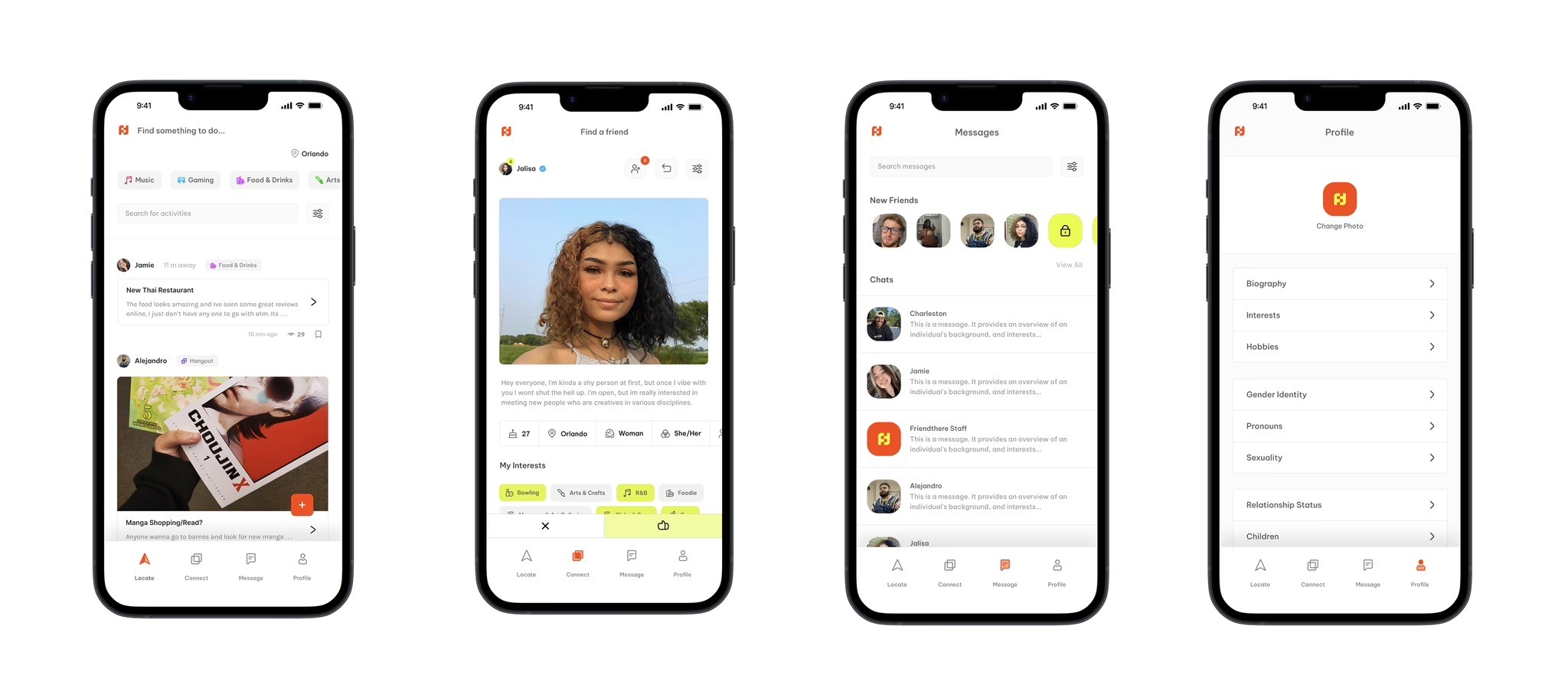
While developing the high-fidelity prototype, I encountered two key issues: the visual design closely resembled Hinge, making it feel like a friends only version of their dating app; and the Location feature failed to clearly convey that users could connect with others nearby for shared activities.
As a designer I think its okay to be inspired by something that has been proven to work, but the final product shouldn't resemble the source of the inspiration.
Version 2
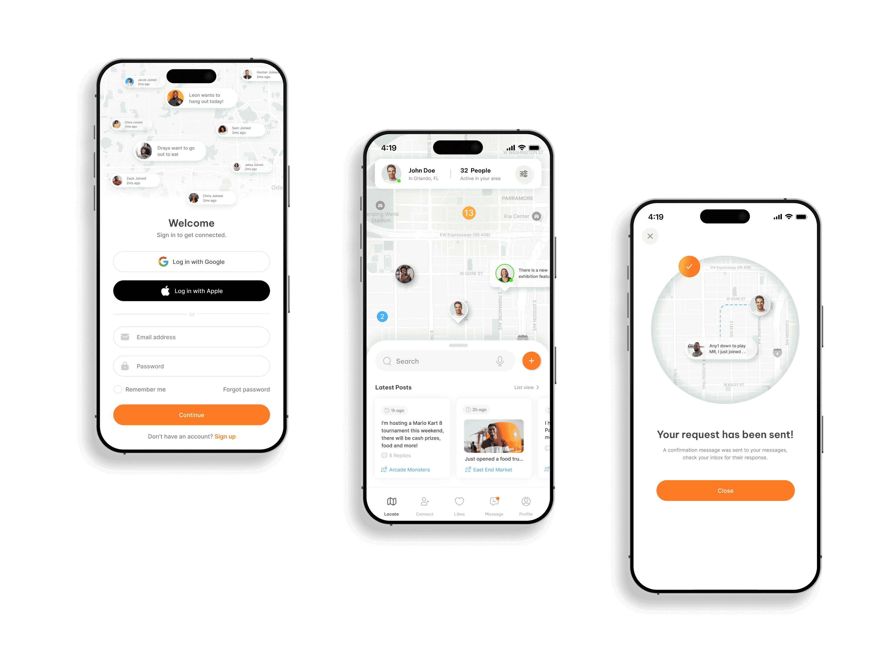
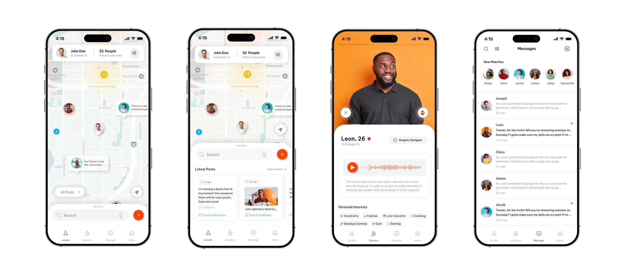
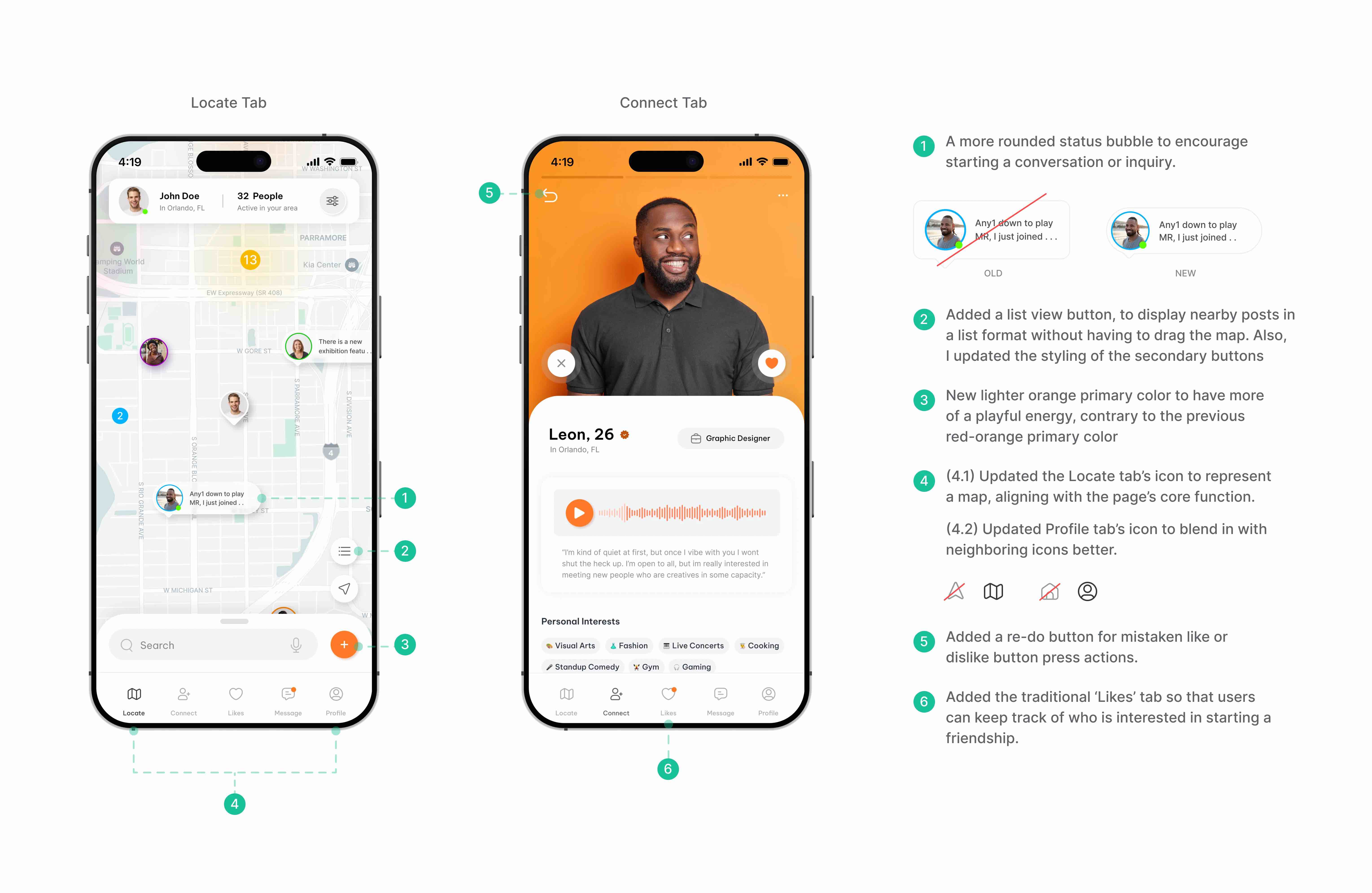
To foster a stronger sense of community, I redesigned the Locate feature to be more literal: using a map to show active users nearby. The updated aesthetics take a more open and innovative approach, setting the experience apart from existing solutions.
Version 2 Testing Results
Using the same testing procedures for the wireframe, I conducted a within-subjects usability test using the UXTweak Software. I then used the participant data to inform more design changes and considerations.
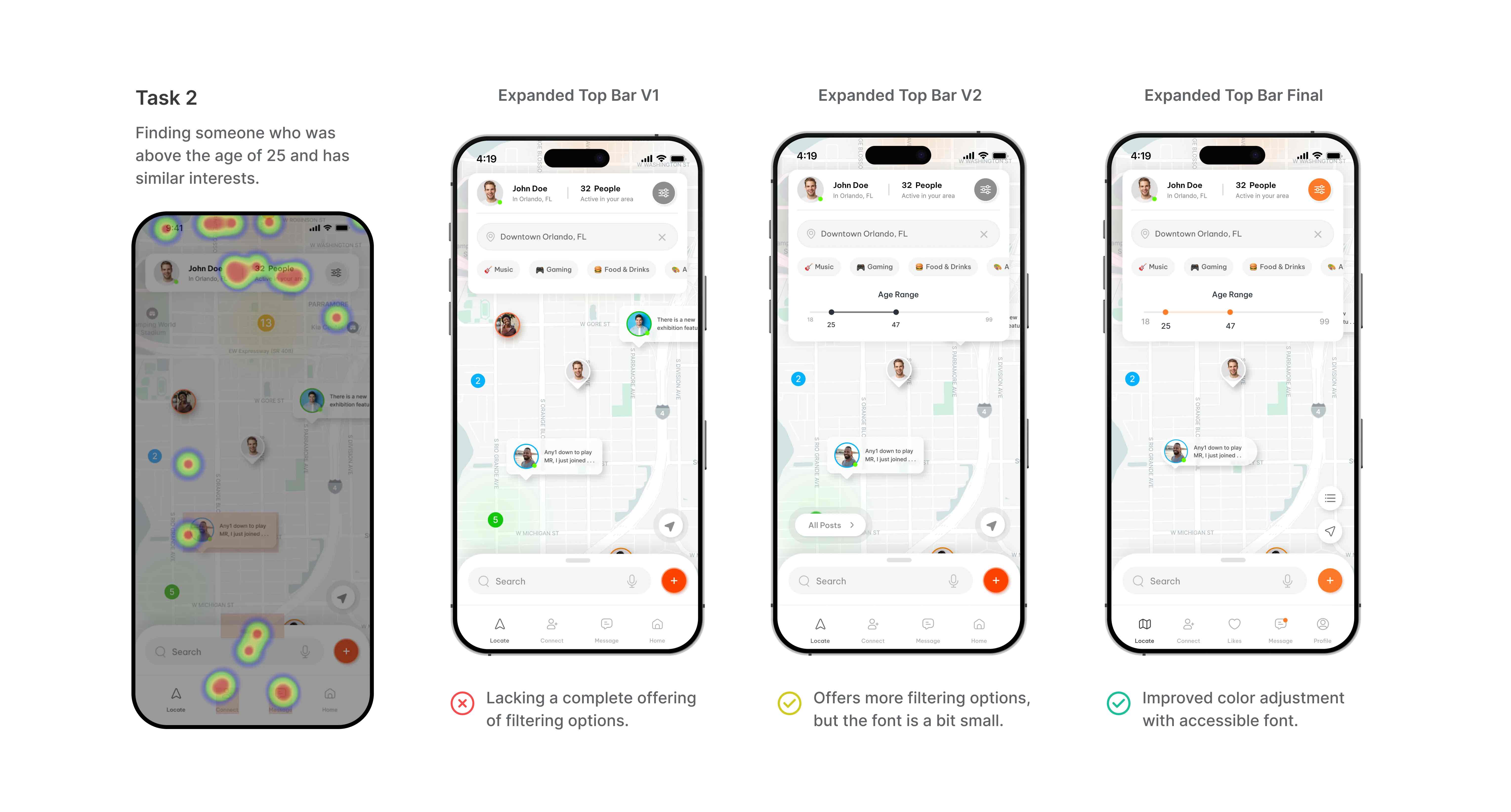
One of the tasks asked users to locate someone who was over the age of 25 and had similar interests as them.
Users struggled to find a profile meeting the target criteria in the Locate Tab. The heat map data showed that their journey started with expanding the top bar menu, so I added an age range filter in the expanded top bar.
Final Iterations
Subscription Model
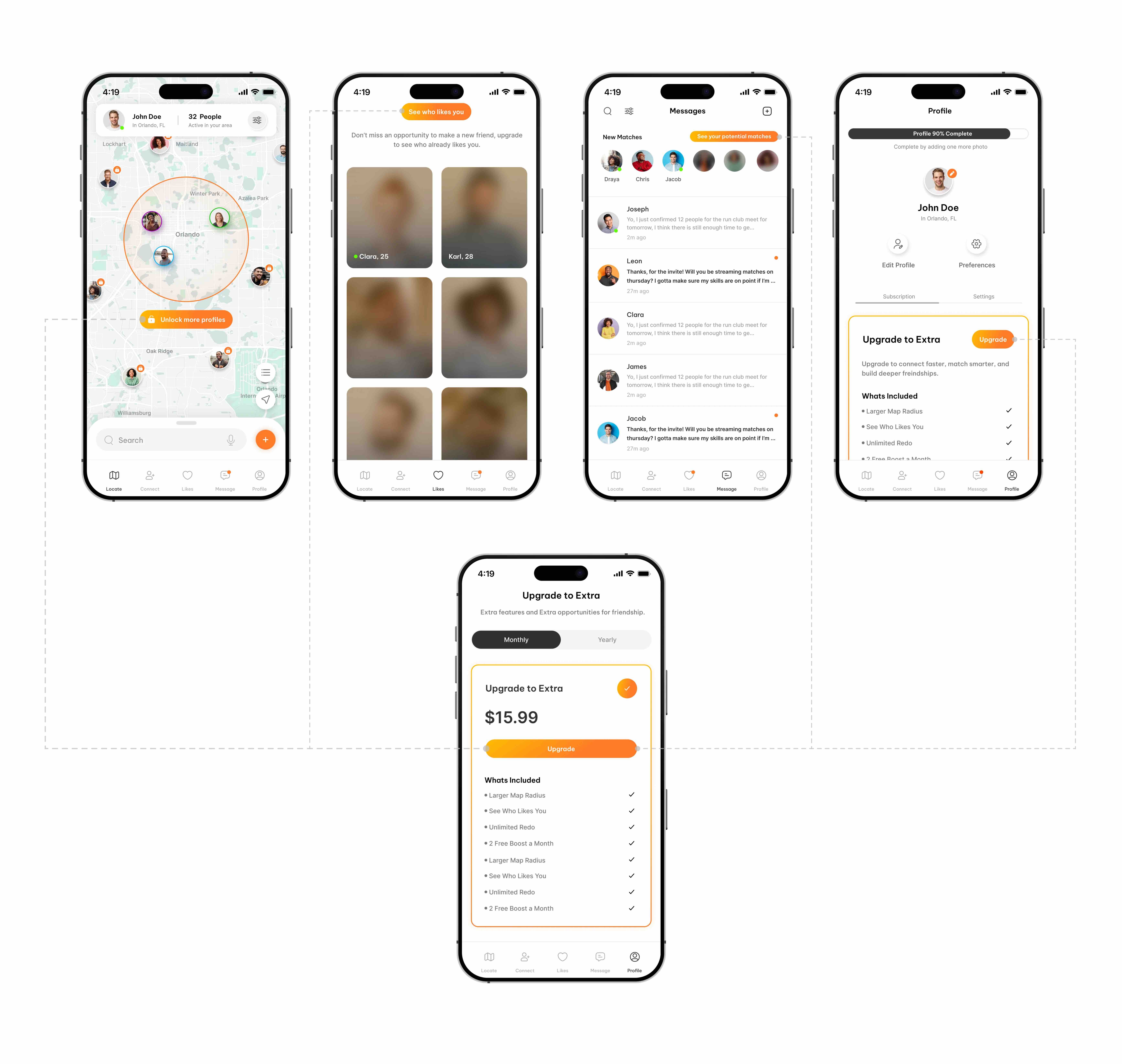
I chose a traditional matchmaking monetization strategy, but tweaked it so there's also a premium extension for the Locate feature, offering an expanded search radius as a paid option. The gradient CTAs signifies the premium experience that awaits.
Onboarding Process
I designed a comprehensive onboarding process that follows standard account creation steps and concludes with an option for new users to verify their account.


